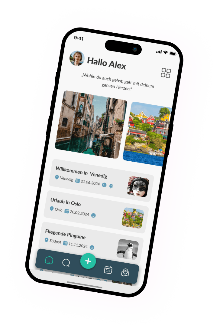
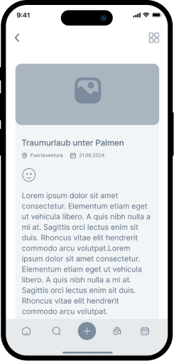
In a team of four, we created an innovative travel diary app designed to capture and relive travel experiences. The app allows users to document their journeys with photos, text entries, and voice recordings, while also tracking their moods throughout.

The first step in our design process was to truly empathise with our users. We conducted interviews and surveys to understand their travel habits, preferences and pain points. We were able to gain valuable insights into what they valued most in a travel diary. It also allowed us to identify key user needs and inspired our design decisions.
“Travel far enough, you meet yourself.” – David Mitchell
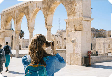
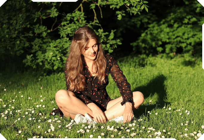
Linda is an active and social person. In her free time she likes to go hiking or cycling. On her trips she takes her camera with her to capture new impressions. She likes to write in her diary to record her thoughts, feelings and impressions. She loves to travel, usually alone. Linda wishes she always had her diary with her on her travels or short trips.
If Linda can upload multiple pieces of information such as diary notes, photos, voice recordings etc. to a single app,
then she has less work to do with the entries and can focus on other important activities.
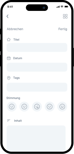
We designed a task flow outlining steps for key actions like creating entries, adding media, and selecting moods. This ensured each task was intuitive, enabling users to document their travels with ease.
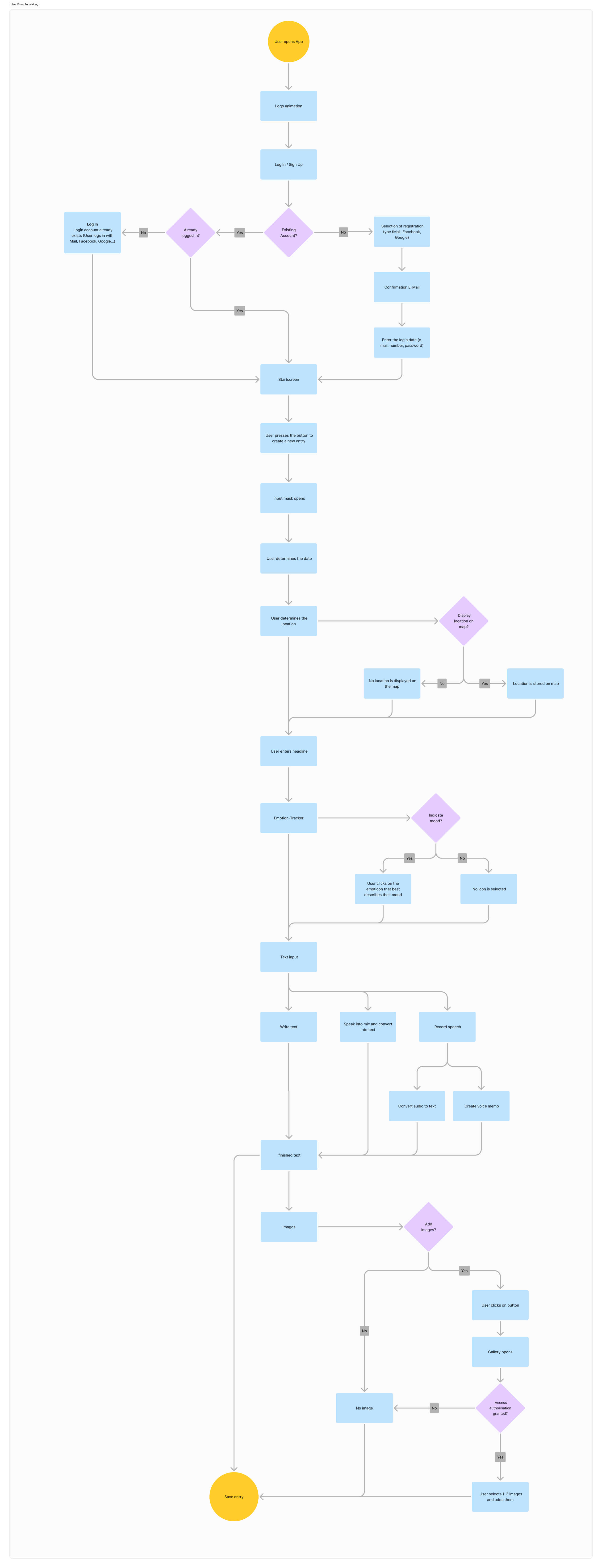
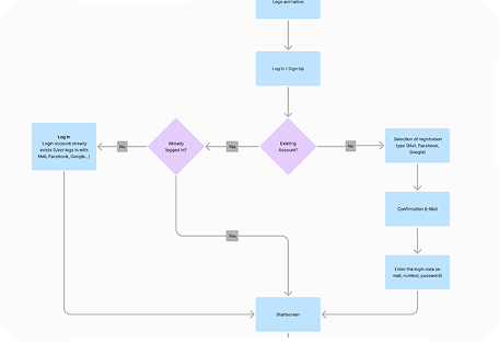
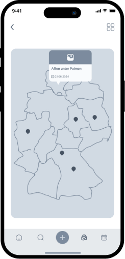
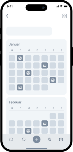
Our user flow mapped the journey from onboarding to revisiting travel memories. By optimising this flow, we created a seamless and engaging experience, encouraging users to relive their adventures.
A stylescape guided us in defining the app’s visual direction. It combined colour palettes, typography and design concepts to create a cohesive aesthetic that reflects the joy of travel.

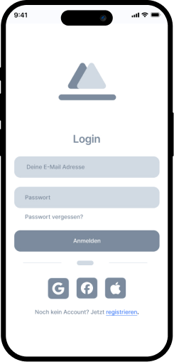
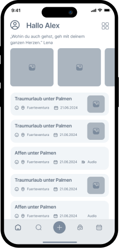
Our lo-fi wireframes acted as initial visual sketches to define the app’s structure. They allowed for quick iterations and helped us test the basic layout before adding finer details.
In the testing phase, we validated the prototype with users. Their feedback helped us refine the usability and make final adjustments.